


pltviz is a Python package for standardized visualization. Routine and novel plotting approaches are formatted to allow for easy variation while providing quick and exact results. Coloration functions are also included for precise colors across plots and to assure that all functions can be ran with color hexes.
Installation ⇧
pltviz can be downloaded from PyPI via pip or sourced directly from this repository:
pip install pltvizgit clone https://github.com/andrewtavis/pltviz.git
cd pltviz
python setup.py installimport pltvizplot ⇧
Plotting methods within pltviz are tailored to provide quick results for staples of data visualization.
See examples/plot for all plotting styles that seamlessly combine graphing functions of seaborn, matplotlib, and pandas.
import matplotlib.pyplot as plt
import pltviz
Examples of routine plotting techniques made easy are:
# The following will be used for the remaining examples
# German political parties
parties = ['CDU/CSU', 'FDP', 'Greens', 'Die Linke', 'SPD', 'AfD']
party_colors = ['#000000', '#ffed00', '#64a12d', '#be3075', '#eb001f', '#009ee0']
# Hypothetical seat allocations to the Bundestag (German parliament)
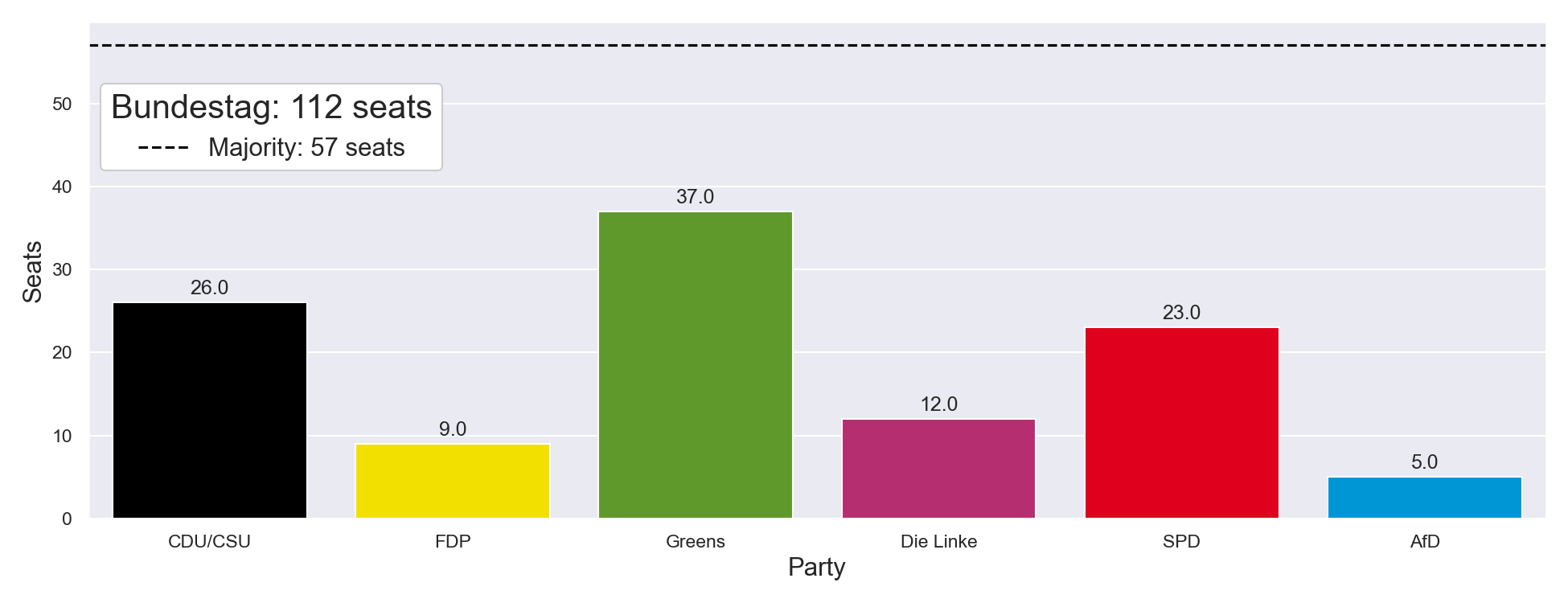
seat_allocations = [26, 9, 37, 12, 23, 5]The following shows pltviz.bar that allows all common options to be selected as binaries:
# Bar plot options such as stacked and label bars are booleans
ax = pltviz.bar(
    counts=seat_allocations,
    labels=parties,
    colors=party_colors,
    horizontal=False,
    stacked=False,
    label_bars=True,
)

# Initialize empty handles and labels
handles, labels = pltviz.legend.gen_elements()

# Add a majority line
ax.axhline(int(sum(seat_allocations) / 2) + 1, ls="--", color="black")
handles.insert(0, Line2D([0], [0], linestyle="--", color="black"))
labels.insert(0, "Majority: {} seats".format(int(sum(seat_allocations) / 2) + 1))

ax.legend(
    handles=handles,
    labels=labels,
    title="Bundestag: {} seats".format(sum(seat_allocations)),
    loc="upper left",
    bbox_to_anchor=(0, 0.9),
    title_fontsize=20,
    fontsize=15,
    frameon=True,
    facecolor="#FFFFFF",
    framealpha=1,
)

ax.set_ylabel("Seats", fontsize=15)
ax.set_xlabel("Party", fontsize=15)
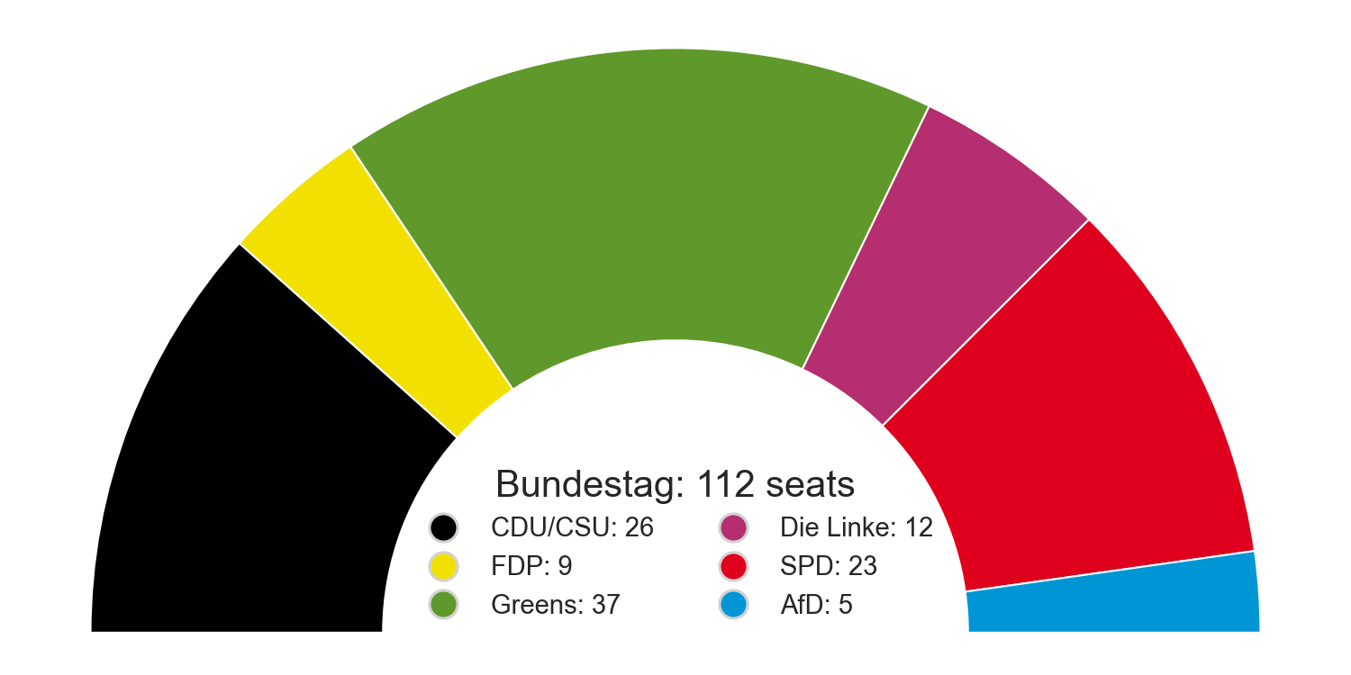
Also included is a pltviz.semipie via matplotlib artists for cases where a simple and condensed plot is needed:
ax = pltviz.semipie(counts=seat_allocations, colors=party_colors, donut_ratio=0.5)

handles, labels = pltviz.legend.gen_elements(
    counts=seat_allocations,
    labels=parties,
    colors=party_colors,
)

ax.legend(
    handles=handles,
    labels=labels,
    title="Bundestag: {} seats".format(sum(seat_allocations)),
    title_fontsize=20,
    fontsize=14,
    ncol=2,
    loc="center",
    bbox_to_anchor=(0.5, 0.17),
    frameon=False,
    facecolor="#FFFFFF",
    framealpha=1,
)

plt.show()
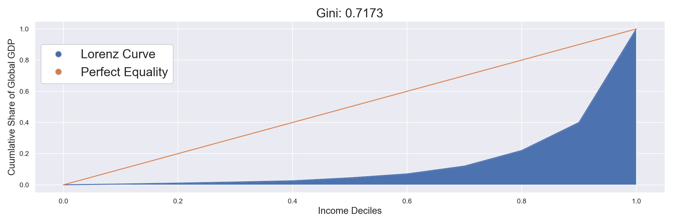
pltviz also includes specialized plots such as pltviz.gini to visualize gini coefficients of inequality:
global_gdp_deciles = [0.49, 0.59, 0.69, 0.79, 1.89, 2.55, 5.0, 10.0, 18.0, 60.0]

ax, gini_coeff = pltviz.gini(shares=global_gdp_deciles)

handles, labels = pltviz.legend.gen_elements(labels=["Lorenz Curve", "Perfect Equality"])

ax.legend(
    handles=handles,
    labels=labels,
    loc='upper left',
    bbox_to_anchor=(0, 0.9),
    fontsize=20,
    frameon=True,
    facecolor='#FFFFFF',
    framealpha=1)

ax.set_title(f'Gini: {gini_coeff}', fontsize=20)
ax.set_ylabel('Cuumlative Share of Global GDP', fontsize=15)
ax.set_xlabel('Income Deciles', fontsize=15)

plt.show()
To-Do ⇧
Please see the contribution guidelines if you are interested in contributing to this project. Work that is in progress or could be implemented includes:
-
Adding standardized examples of further plots and visualizations (see issue)
-
Finishing the coloration on the outer ring of pltviz.pie
-
Improving tests for greater code coverage
-
Improving code quality by refactoring large functions and checking conventions
-
Allowing all plotting variations to be seamlessly plotted from either lists or dataframe columns where applicable