PandasEcharts

简介
安装
pip 安装
$ pip install pandasecharts
源码安装
$ git clone https://github.com/gamersover/pandasecharts
$ cd pandasecharts
$ pip install -r requirements.txt
$ python setup.py install
使用
notebook环境
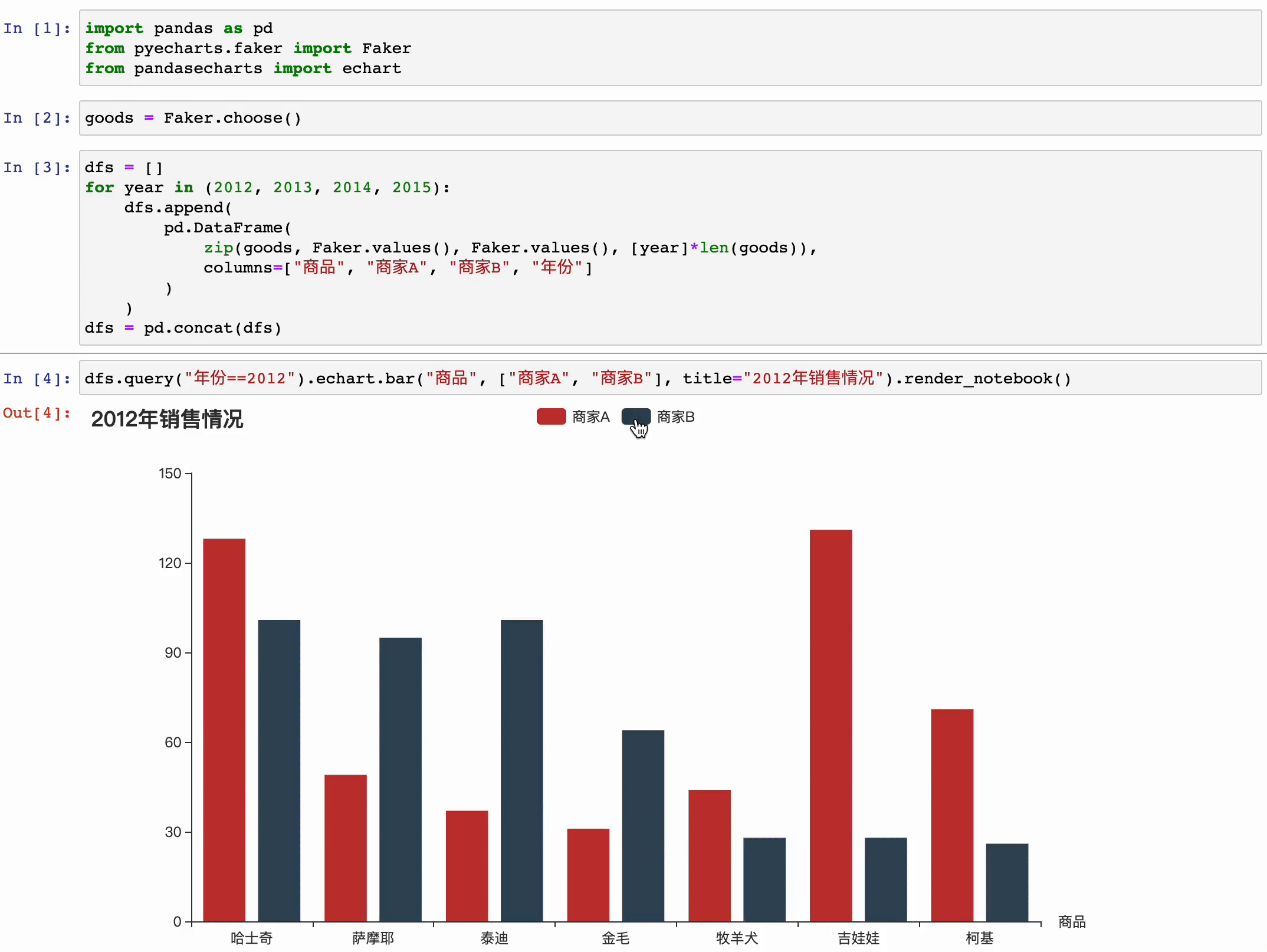
- 基本直方图
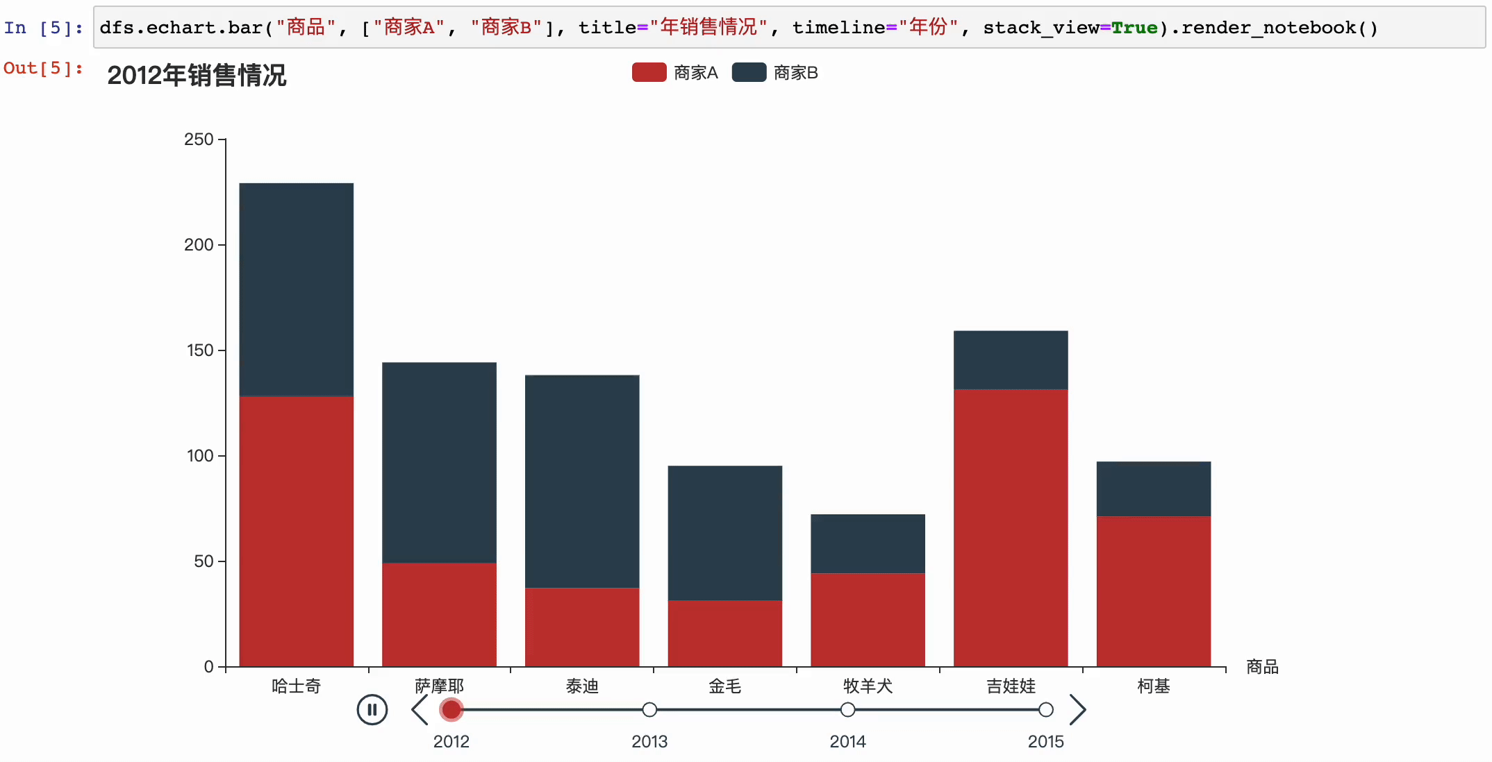
- 带时间变化的直方图
后续计划
目前已支持图表类型
- Pie
- Bar
- Bar3d
- Line
- Scatter
后续支持
- Boxplot
- Funnel
- Line3d
- Scatter3d
- Geo
- Map
License
MIT ©gamersover

 1.4k Dec 15, 2022
 14.1k Jan 03, 2023
 2.8k Jan 03, 2023
 129 Jan 04, 2023
 52 Jun 10, 2022
 1 Jan 22, 2022
 50 Dec 30, 2022
 16 Dec 17, 2022
 15 Dec 10, 2022
 670 Jan 09, 2023
 10 Jun 01, 2022
 31 Dec 15, 2022
 3 Dec 25, 2021
 4.3k Dec 28, 2022
 249 Jan 06, 2023
 9 Dec 31, 2021
 1 Jun 26, 2022
 144 Dec 14, 2022
 2 Aug 30, 2022