YOPO is an interactive dashboard which generates various standard plots.

Overview

YOPO (You Only Plot Once)

Python Plotly Flask

You Only Plot Once

YOPO is an interactive dashboard which generates various standard plots.you can create various graphs and charts with a click of a button. This tool uses Dash and Flask in backend.

Table of contents

Installing YOPO

To install from PyPi:

pip install yopo

To install from source:

cd <your_project>
git clone https://github.com/chekoduadarsh/YOPO-You-Only-Plot-Once.git
# or download and unzip https://github.com/AutoViML/AutoViz/archive/master.zip
# if you dont have virtualenv install from here https://packaging.python.org/en/latest/guides/installing-using-pip-and-virtual-environments/
python3 -m venv env
source env/bin/activate
git clone https://github.com/chekoduadarsh/YOPO-You-Only-Plot-Once.git
# or download and unzip https://github.com/AutoViML/AutoViz/archive/master.zip
cd yopo
python3 -m pip install .

Usage

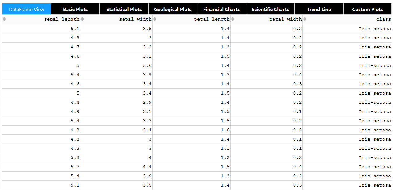
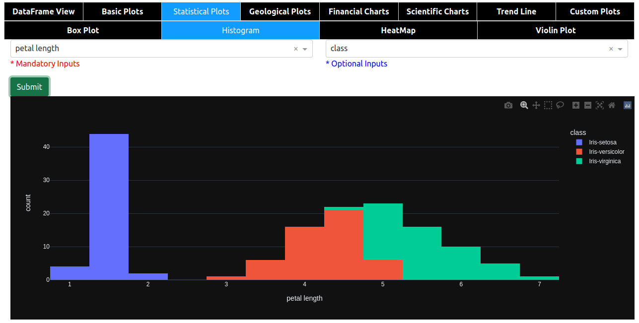
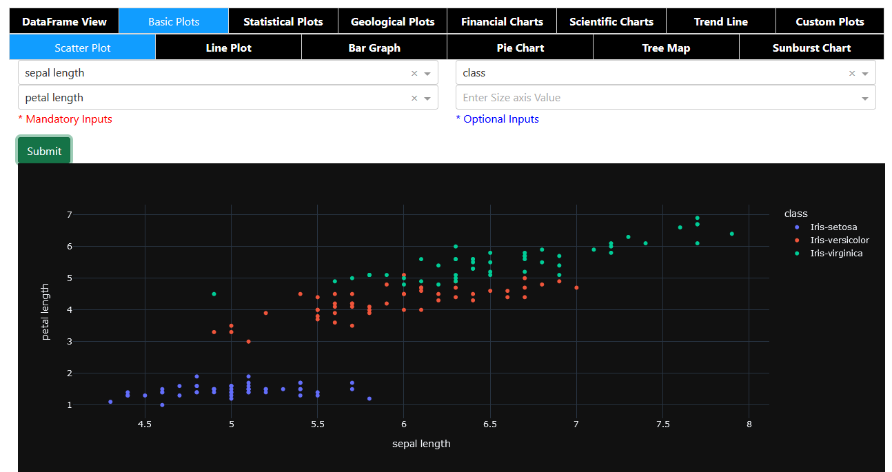
its very easy to use YOPO, u just need to pass the dataframe and it will generate the dashboard.

A code like this will generate multiple plots like given below.

Contribute

If you find any error or need support please raise a issue. If you think you can add a feature, or help solve a bug please raise a PR This repo welcomes any kind of contributions pray

Feel free to adapt it criticize it and support it the way you like!!

License

Apache License, Version 2.0

You might also like...
This package creates clean and beautiful matplotlib plots that work on light and dark backgrounds

This package creates clean and beautiful matplotlib plots that work on light and dark backgrounds. Inspired by the work of Edward Tufte.

Moscow DEG 2021 elections plots

Построение графиков на основе публичных данных о ДЭГ в Москве в 2021г. Описание Скрипты в данном репозитории позволяют собственноручно построить графи

This plugin plots the time you spent on a tag as a histogram.

This plugin plots the time you spent on a tag as a histogram.

A minimal Python package that produces slice plots through h5m DAGMC geometry files

A minimal Python package that produces slice plots through h5m DAGMC geometry files Installation pip install dagmc_geometry_slice_plotter Python API U

MPL Plotter is a Matplotlib based Python plotting library built with the goal of delivering publication-quality plots concisely.

MPL Plotter is a Matplotlib based Python plotting library built with the goal of delivering publication-quality plots concisely.

Generate
Generate "Jupiter" plots for circular genomes

jupiter Generate "Jupiter" plots for circular genomes Description Python scripts to generate plots from ViennaRNA output. Written in "pidgin" python w

A Python function that makes flower plots.

Flower plot A Python 3.9+ function that makes flower plots. Installation This package requires at least Python 3.9. pip install

Standardized plots and visualizations in Python

Standardized plots and visualizations in Python pltviz is a Python package for standardized visualization. Routine and novel plotting approaches are f

The plottify package is makes matplotlib plots more legible

plottify The plottify package is makes matplotlib plots more legible. It's a thin wrapper around matplotlib that automatically adjusts font sizes, sca

Comments
  • Add predefined palettes as dropdown.

    Add predefined palettes as dropdown.

    Is your feature request related to a problem? An enhancement: to give the possibility to choose a color palette from a dropdown menu.

    There are too many predefined palettes at [https://plotly.com/python/builtin-colorscales/](https://plotly.com/python/builtin-colorscales/, and the menu would become too long), so a dozen should be enough.

    As a palette list I would consider:

    • Viridis
    • Magma
    • Turbo
    • Bluered
    • Hot
    • RdBu
    • YlOrRd
    • Thermal
    • Agsunset
    • Balance
    • Portland
    • Edge

    If the dropdown menu shows the palette colors (each image can be downloaded from the page) together with the name, it becomes very intuitive.

    enhancement 
    opened by Nemecsek 4
  • Give the possibility to add extra parameters.

    Give the possibility to add extra parameters.

    Is your feature request related to a problem? I am using Histograms, but the number of bins is automatic and cannot be changed. Other plot types can be optimized by adding extra parameters (i.e. to change the size of scatterplots' markers).

    Describe the solution you'd like Of course it is not possible to add parameters according to every users' needs.

    The easiest solution is to give the possibility to enter extra params into an edit box such as: Screenshot_20220218_092905

    This string can be transformed into a dictionary with eval(f'dict({ edit_box_content })'), and the dictionary then added to the plots' parameters.

    enhancement 
    opened by Nemecsek 2
  • Dataframe's index is missing among the selectable fields in X axis

    Dataframe's index is missing among the selectable fields in X axis

    As for the title, it is not possible to directly select the (unnamed) index among the X axis fields. Index is the most obvious choice for Y axis in Scatter, Line, etc.

    opened by Nemecsek 0
  • Let multiple series to be visualized in a single plot.

    Let multiple series to be visualized in a single plot.

    In Scatter, Line, Bar (and possibly other plots) it would be nice to visualize multiple series on the same figure. This would mean to select not only a single Y axis value, but to allow multiple selections (at least one).

    To keep things simple, I would draw all of them on the same figure, avoiding at the moment to provide sub figures.

    enhancement 
    opened by Nemecsek 1
Releases(alpha)
  • alpha(Feb 15, 2022)

Owner
ADARSH C
Python | Machine Learning | Deep Learning | Flask | mongodb | Embedded systems
ADARSH C
nvitop, an interactive NVIDIA-GPU process viewer, the one-stop solution for GPU process management

An interactive NVIDIA-GPU process viewer, the one-stop solution for GPU process management.

Xuehai Pan 1.3k Jan 02, 2023
trade bot connected to binance API/ websocket.,, include dashboard in plotly dash to visualize trades and balances

Crypto trade bot 1. What it is Trading bot connected to Binance API. This project made for fun. So ... Do not use to trade live before you have backte

G 3 Oct 07, 2022
Python library that makes it easy for data scientists to create charts.

Chartify Chartify is a Python library that makes it easy for data scientists to create charts. Why use Chartify? Consistent input data format: Spend l

Spotify 3.2k Jan 04, 2023
A Jupyter - Three.js bridge

pythreejs A Python / ThreeJS bridge utilizing the Jupyter widget infrastructure. Getting Started Installation Using pip: pip install pythreejs And the

Jupyter Widgets 844 Dec 27, 2022
Pydrawer: The Python package for visualizing curves and linear transformations in a super simple way

pydrawer 📐 The Python package for visualizing curves and linear transformations in a super simple way. ✏️ Installation Install pydrawer package with

Dylan Tintenfich 56 Dec 30, 2022
A Python library created to assist programmers with complex mathematical functions

libmaths was created not only as a learning experience for me, but as a way to make mathematical models in seconds for Python users using mat

Simple 73 Oct 02, 2022
A simple python tool for explore your object detection dataset

A simple tool for explore your object detection dataset. The goal of this library is to provide simple and intuitive visualizations from your dataset and automatically find the best parameters for ge

GRADIANT - Centro Tecnolóxico de Telecomunicacións de Galicia 142 Dec 25, 2022
📊📈 Serves up Pandas dataframes via the Django REST Framework for use in client-side (i.e. d3.js) visualizations and offline analysis (e.g. Excel)

📊📈 Serves up Pandas dataframes via the Django REST Framework for use in client-side (i.e. d3.js) visualizations and offline analysis (e.g. Excel)

wq framework 1.2k Jan 01, 2023
A curated list of awesome Dash (plotly) resources

Awesome Dash A curated list of awesome Dash (plotly) resources Dash is a productive Python framework for building web applications. Written on top of

Luke Singham 1.7k Jan 07, 2023
Eulera Dashboard is an easy and intuitive way to get a quick feel of what’s happening on the world’s market.

an easy and intuitive way to get a quick feel of what’s happening on the world’s market ! Eulera dashboard is a tool allows you to monitor historical

Salah Eddine LABIAD 4 Nov 25, 2022
2021 grafana arbitrary file read

2021_grafana_arbitrary_file_read base on pocsuite3 try 40 default plugins of grafana alertlist annolist barchart cloudwatch dashlist elasticsearch gra

ATpiu 5 Nov 09, 2022
Python package that generates hardware pinout diagrams as SVG images

PinOut A Python package that generates hardware pinout diagrams as SVG images. The package is designed to be quite flexible and works well for general

336 Dec 20, 2022
I'm doing Genuary, an aritifiacilly generated month to build code that make beautiful things

Genuary 2022 I'm doing Genuary, an aritifiacilly generated month to build code that make beautiful things. Every day there is a new prompt for making

Joaquín Feltes 1 Jan 10, 2022
A set of three functions, useful in geographical calculations of different sorts

GreatCircle A set of three functions, useful in geographical calculations of different sorts. Available for PHP, Python, Javascript and Ruby. Live dem

72 Sep 30, 2022
Data aggregated from the reports found at the MCPS COVID Dashboard into a set of visualizations.

Montgomery County Public Schools COVID-19 Visualizer Contents About this project Data Support this project About this project Data All data we use can

James 3 Jan 19, 2022
Python package to visualize and cluster partial dependence.

partial_dependence A python library for plotting partial dependence patterns of machine learning classifiers. The technique is a black box approach to

NYU Visualization Lab 25 Nov 14, 2022
Advanced hot reloading for Python

The missing element of Python - Advanced Hot Reloading Details Reloadium adds hot reloading also called "edit and continue" functionality to any Pytho

Reloadware 1.9k Jan 04, 2023
Pglive - Pglive package adds support for thread-safe live plotting to pyqtgraph

Live pyqtgraph plot Pglive package adds support for thread-safe live plotting to

Martin Domaracký 15 Dec 10, 2022
An application that allows you to design and test your own stock trading algorithms in an attempt to beat the market.

StockBot is a Python application for designing and testing your own daily stock trading algorithms. Installation Use the

Ryan Cullen 280 Dec 19, 2022
The visual framework is designed on the idea of module and implemented by mixin method

Visual Framework The visual framework is designed on the idea of module and implemented by mixin method. Its biggest feature is the mixins module whic

LEFTeyes 9 Sep 19, 2022