Practical Data Visualization with Python
Overview
All views expressed on this site are my own and do not represent the opinions of any entity with which I have been, am now, or will be affiliated.
This repository contains all materials related to a lecture / seminar I teach on practical data visualization with python. What I mean by "practical" is that the materials herein do not focus on one particular library or data visualization method; rather, my goal is to empower the consumer of this content with the tools, heuristics, and methods needed to handle a wide variety of data visualization problems.
If you have questions, comments, or suggested alterations to these materials, please open an issue here on GitHub. Also, don't hesitate to reach out via LinkedIn.
Outline of Materials
Below you'll find a brief outline of the content contained in the four sections of this seminar, along with notebook links, and an example visualization from each section. For each section there is a separate notebook of python code containing all the materials for that section. Each notebook will start with a few setup steps--package imports and data prep mostly--that are almost identical between the notebooks, directly after which comes the content for each section. For information about the data used in these materials, check out the data_prep_nb.ipynb notebook, the easy-to-view version of which is hosted here.
Section 1: Why We Visualize
Here is the link to the easy-to-view notebook for this section of material.
Here is the link to the GitHub-hosted notebook for this section of the material.
- The power of visual data representation and storytelling.
- A few principles and heuristics of visualization.
- The building blocks of visualization explored.
Example Visualization from this Section:
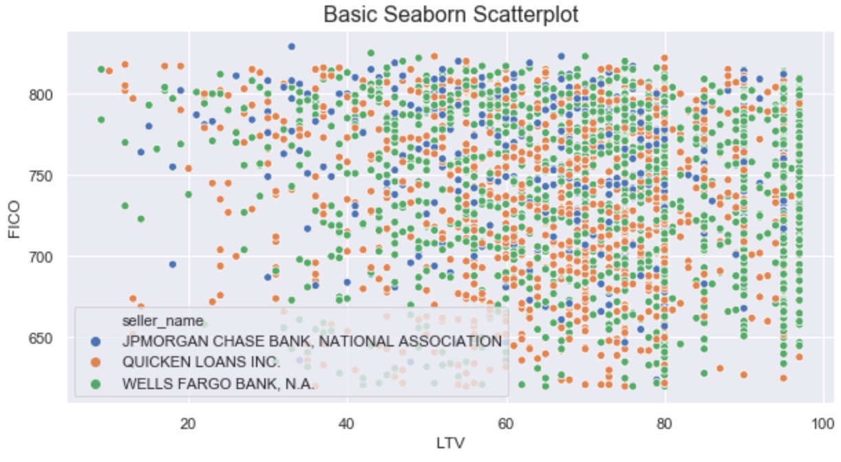
Section 2: Overview of Python Visualization Landscape
Here is the link to the easy-to-view notebook for this section of material.
Here is the link to the GitHub-hosted notebook for this section of the material.
- Intro to the visualization ecosystem: python's Tower of Babel.
- Smorgasbord of packages explored through a single example viz.
- Quick & dirty (and subjective) heuristics for picking a visualization package.
Example Visualization from this Section:
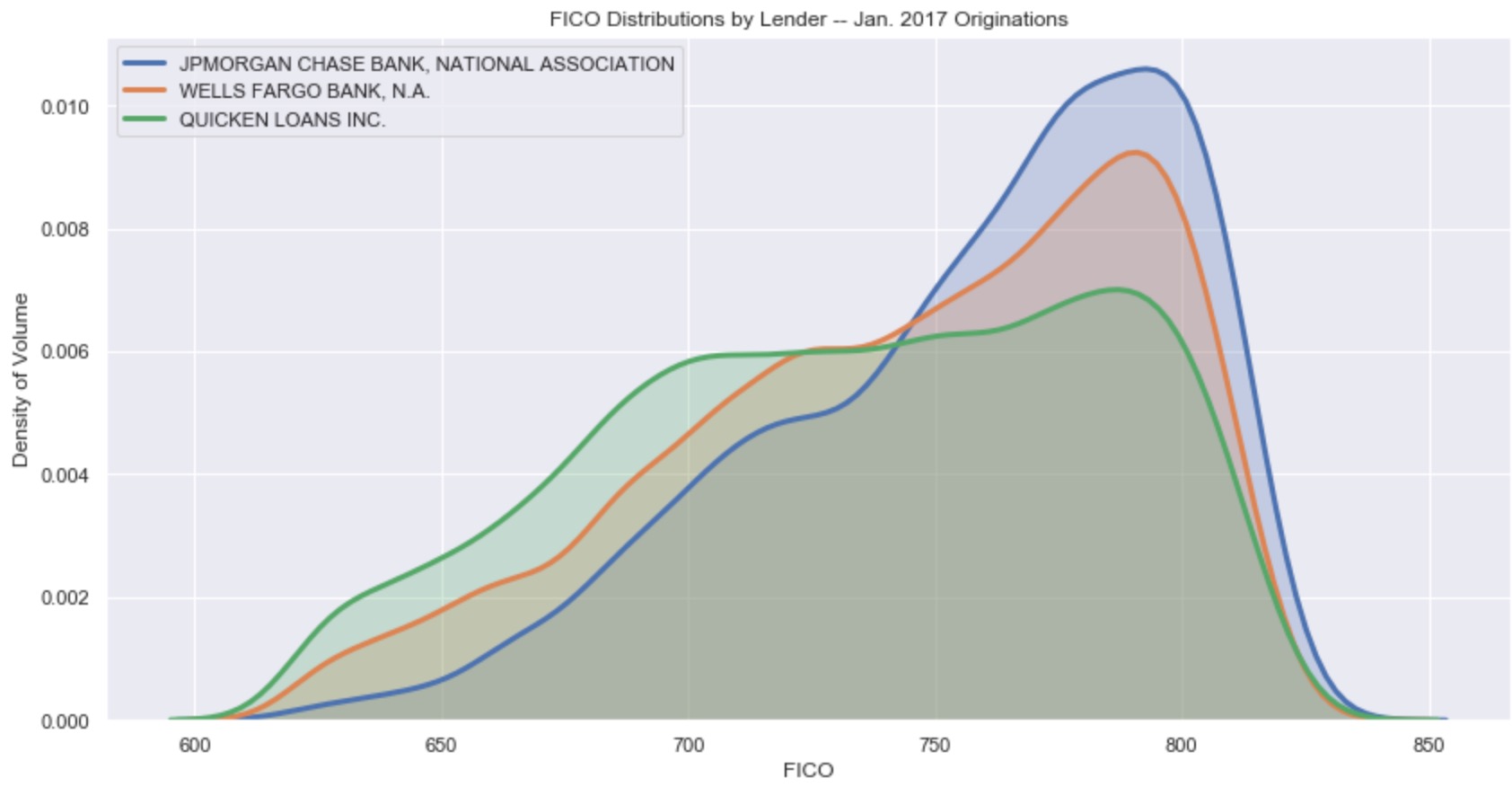
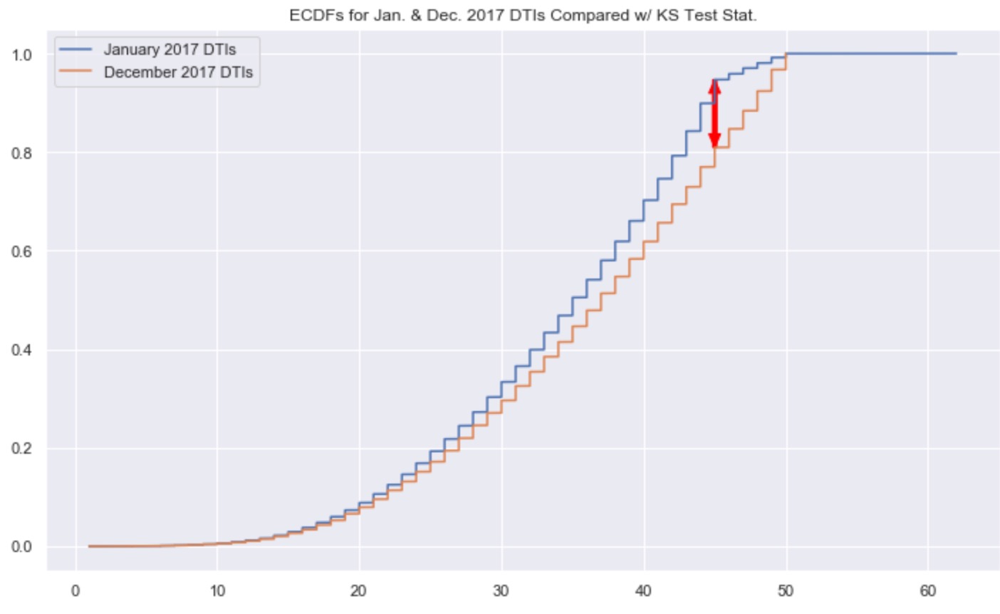
Section 3: Statistical Visualization in the Wild
Here is the link to the easy-to-view notebook for this section of material.
Here is the link to the GitHub-hosted notebook for this section of the material.
- Example business use case of data visualization:
- Observational:
- mean, median, and variance
- distributions
- Inferential:
- parametric tests
- non-parametric tests
- Observational:
Example Visualization from this Section:
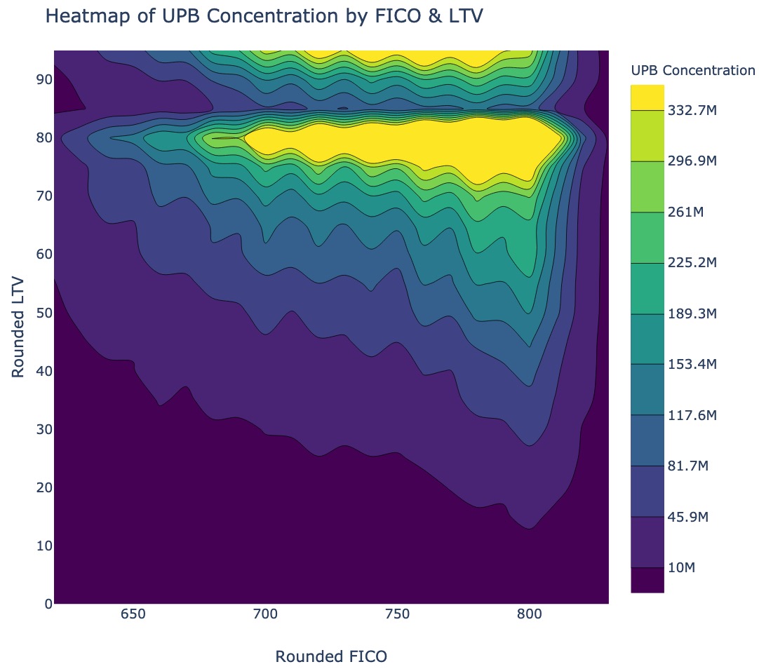
Section 4: Library Deep-Dive (Plotly)
Here is the link to the easy-to-view notebook for this section of material.
Here is the link to the GitHub-hosted notebook for this section of the material.
- Quick and simple data visualizations with Plotly Express.
- Additional control and complexity with base Plotly.
Example Visualization from this Section:
Homework Exercises
There is a homework associated with these materials, for those interested. Given the open-ended nature of the homework, there is no answer key. That said, if you're working through it and would like some feedback, feel free to reach out to me via LinkedIn.
Here is the link to the easy-to-view homework notebook.
Here is the link to the GitHub-hosted version of the homework notebook.
Setup Instructions
- clone this repository
- create a virtual environment using
python3 -m venv env- additional information about this can be found here
- activate that virtual environment using
source env/bin/activate - install needed packages using
pip install -r requirements.txt- additional information about this can be found here
- run an instance of jupyter lab out of your virutal env using
env/bin/jupyter-lab - open and run the four main files of content for this course--one for each section:
part_1_main_nb.ipynbpart_2_main_nb.ipynbpart_3_main_nb.ipynbpart_4_main_nb.ipynb

 13 Oct 27, 2022
 9 Jul 15, 2022
 205 Jan 07, 2023
 462 Jan 02, 2023
 90 Dec 14, 2022
 7 Dec 28, 2022
 56 Nov 17, 2022
 205 Jan 01, 2023
 55 Dec 28, 2022
 6 Oct 19, 2021
 1 Nov 17, 2021
 185 Jan 06, 2023
 247 Dec 18, 2021
 235 Jan 02, 2023
 5 Feb 16, 2022
 26 Dec 17, 2022
 13 Oct 12, 2022
 3.4k Jan 06, 2023
 110 Dec 22, 2022
 3.3k Dec 27, 2022