Painlessly create beautiful matplotlib plots.

Overview

Announcement

Thank you to everyone who has used prettyplotlib and made it what it is today! Unfortunately, I no longer have the bandwidth to maintain prettyplotlib. I recommend using seaborn. Using seaborn, to get the prettyplotlib style, do:

import seaborn as sns
sns.set(style='ticks', palette='Set2')

And to remove "chartjunk", do:

sns.despine()

If you have discrete pull requests, I will accept them, but I personally will no longer fix bugs.

If you are a biological scientist looking for ways to analyze your big-ish (20+ samples) data, check out my main project, flotilla.

Build Status

prettyplotlib

Python matplotlib-enhancer library which painlessly creates beautiful default matplotlib plots. Inspired by Edward Tufte's work on information design and Cynthia Brewer's work on color perception.

I truly believe that scientific progress is impeded when improper data visualizations are used. I spent a lot of time tweaking my figures to make them more understandable, and realized the scientific world could be a better place if the default parameters for plotting libraries followed recent advances in information design research. And thus prettyplotlib was born.

Requirements:

  • matplotlib. Can be installed via pip install matplotlib or easy_install matplotlib
  • brewer2mpl. Can be installed via pip install brewer2mpl or easy_install brewer2mpl

Comparison to matplotlib

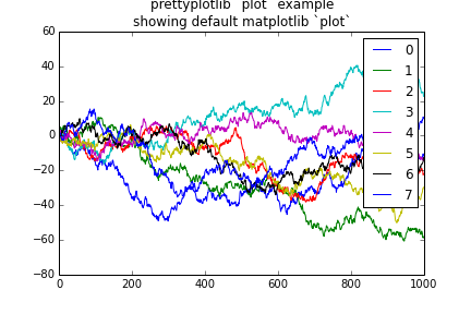
matplotlib default plot
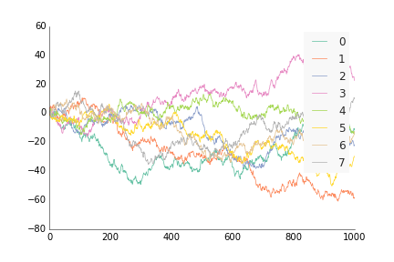
prettyplotlib default plot
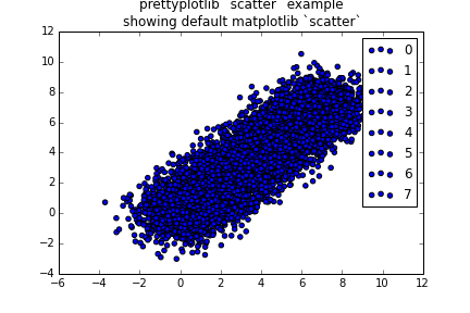
matplotlib default scatter
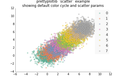
prettyplotlib default scatter
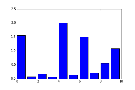
matplotlib default bar
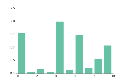
prettyplotlib default bar
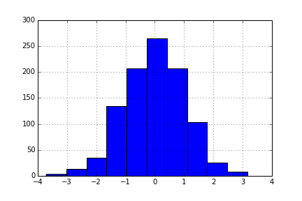
matplotlib default hist
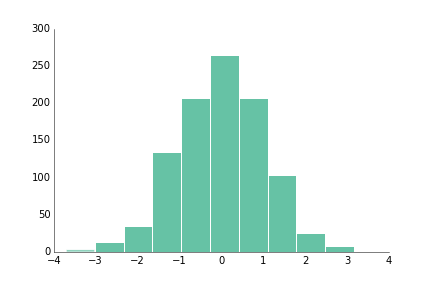
prettyplotlib default hist
matplotlib default hist
with grid
prettyplotlib default hist
with grid
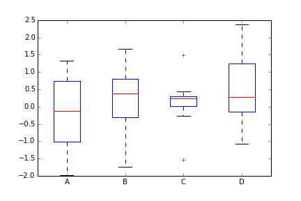
matplotlib default boxplot
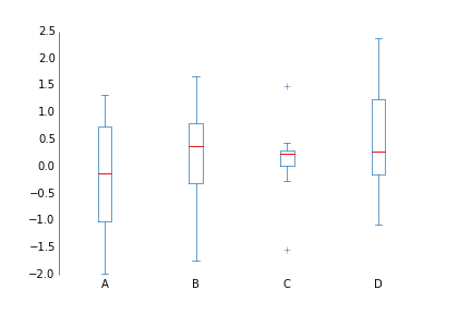
prettyplotlib default boxplot
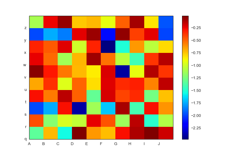
matplotlib default pcolormesh
positive and negative data
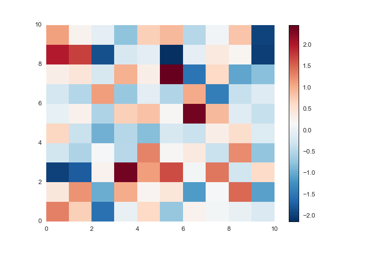
prettyplotlib default pcolormesh
positive and negative data
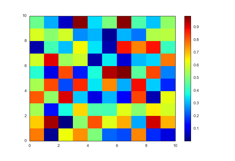
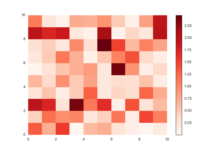
matplotlib default pcolormesh
positive data only
prettyplotlib default pcolormesh
positive data only
matplotlib pcolormesh
negative-valued data with labels
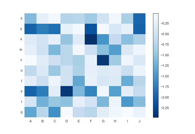
prettyplotlib pcolormesh
negative-valued data with labels

Quotes

"Dis ain't no uglyplotlib" - Anonymous

Owner
Olga Botvinnik
peppy computational biologist
Olga Botvinnik
basemap - Plot on map projections (with coastlines and political boundaries) using matplotlib.

Basemap Plot on map projections (with coastlines and political boundaries) using matplotlib. ⚠️ Warning: this package is being deprecated in favour of

Matplotlib Developers 706 Dec 28, 2022
This plugin plots the time you spent on a tag as a histogram.

This plugin plots the time you spent on a tag as a histogram.

Tom Dörr 7 Sep 09, 2022
With Holoviews, your data visualizes itself.

HoloViews Stop plotting your data - annotate your data and let it visualize itself. HoloViews is an open-source Python library designed to make data a

HoloViz 2.3k Jan 02, 2023
a robust room presence solution for home automation with nearly no false negatives

Argos Room Presence This project builds a room presence solution on top of Argos. Using just a cheap raspberry pi zero w (plus an attached pi camera,

Angad Singh 46 Sep 18, 2022
📊 Extensions for Matplotlib

📊 Extensions for Matplotlib

Nico Schlömer 519 Dec 30, 2022
kyle's vision of how datadog's python client should look

kyle's datadog python vision/proposal not for production use See examples/comprehensive.py for a mostly working example of the proposed API. 📈 🐶 ❤️

Kyle Verhoog 2 Nov 21, 2021
Streaming pivot visualization via WebAssembly

Perspective is an interactive visualization component for large, real-time datasets. Originally developed for J.P. Morgan's trading business, Perspect

The Fintech Open Source Foundation (www.finos.org) 5.1k Dec 27, 2022
eoplatform is a Python package that aims to simplify Remote Sensing Earth Observation by providing actionable information on a wide swath of RS platforms and provide a simple API for downloading and visualizing RS imagery

An Earth Observation Platform Earth Observation made easy. Report Bug | Request Feature About eoplatform is a Python package that aims to simplify Rem

Matthew Tralka 4 Aug 11, 2022
Active Transport Analytics Model (ATAM) is a new strategic transport modelling and data visualization framework for Active Transport as well as emerging micro-mobility modes

{ATAM} Active Transport Analytics Model Active Transport Analytics Model (“ATAM”) is a new strategic transport modelling and data visualization framew

Peter Stephan 0 Jan 12, 2022
Data Visualization Guide for Presentations, Reports, and Dashboards

This is a highly practical and example-based guide on visually representing data in reports and dashboards.

Anton Zhiyanov 395 Dec 29, 2022
A toolkit to generate MR sequence diagrams

mrsd: a toolkit to generate MR sequence diagrams mrsd is a Python toolkit to generate MR sequence diagrams, as shown below for the basic FLASH sequenc

Julien Lamy 3 Dec 25, 2021
PyFlow is a general purpose visual scripting framework for python

PyFlow is a general purpose visual scripting framework for python. State Base structure of program implemented, such things as packages disco

1.8k Jan 07, 2023
nptsne is a numpy compatible python binary package that offers a number of APIs for fast tSNE calculation.

nptsne nptsne is a numpy compatible python binary package that offers a number of APIs for fast tSNE calculation and HSNE modelling. For more detail s

Biomedical Visual Analytics Unit LUMC - TU Delft 29 Jul 05, 2022
A Jupyter - Leaflet.js bridge

ipyleaflet A Jupyter / Leaflet bridge enabling interactive maps in the Jupyter notebook. Usage Selecting a basemap for a leaflet map: Loading a geojso

Jupyter Widgets 1.3k Dec 27, 2022
cqMore is a CadQuery plugin based on CadQuery 2.1.

cqMore (under construction) cqMore is a CadQuery plugin based on CadQuery 2.1. Installation Please use conda to install CadQuery and its dependencies

Justin Lin 36 Dec 21, 2022
Draw interactive NetworkX graphs with Altair

nx_altair Draw NetworkX graphs with Altair nx_altair offers a similar draw API to NetworkX but returns Altair Charts instead. If you'd like to contrib

Zachary Sailer 206 Dec 12, 2022
A python script to visualise explain plans as a graph using graphviz

README Needs to be improved Prerequisites Need to have graphiz installed on the machine. Refer to https://graphviz.readthedocs.io/en/stable/manual.htm

Edward Mallia 1 Sep 28, 2021
Plotting data from the landroid and a raspberry pi zero to a influx-db

landroid-pi-influx Plotting data from the landroid and a raspberry pi zero to a influx-db Dependancies Hardware: Landroid WR130E Raspberry Pi Zero Wif

2 Oct 22, 2021
A concise grammar of interactive graphics, built on Vega.

Vega-Lite Vega-Lite provides a higher-level grammar for visual analysis that generates complete Vega specifications. You can find more details, docume

Vega 4k Jan 08, 2023