Package managers visualization

Related tags

Data Visualizationpm
Overview

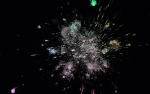
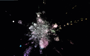
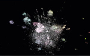
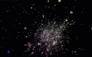
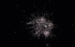
Software Galaxies

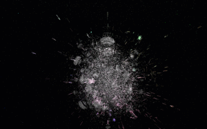
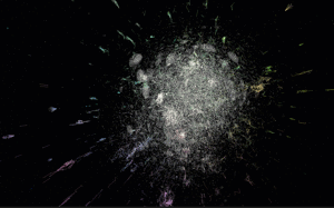
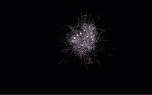
This repository combines visualizations of major software package managers.

All visualizations are available here: http://anvaka.github.io/pm/#/

Please read operating manual - it is short and describes basic navigation principles.

Repository was create for my talk at CascadiaJS 2015

After conference update - video - slides

Friends, you are awesome! I can't express how much I appreciate all your kind words and warm feedback. It really means a world for me. Thank you!

Individual Visualizations

Each graph is indexed individually, and data is pushed to gh-pages branch of galactic-data.

Bower
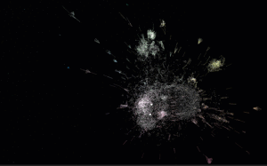

indexer | demo

PHP Composer


indexer | demo

Ruby gems


indexer | demo

npm


indexer | demo

Go


indexer | demo

R language


indexer | demo

Debian


indexer | demo

Arch Linux


indexer | demo

Arch Linux + AUR


indexer | demo

NuGet


indexer | demo

Homebrew


indexer | demo

PyPI


indexer | demo

Fedora


indexer | demo

Rust Crates


indexer | demo

Elm


indexer | demo

local development

git clone https://github.com/anvaka/pm
cd pm
npm i
npm start

This will start local development sever with auto-rebuild.

Your own graphs

This section has detailed instructions about how to use the tool with your own graphs. Before you read any further, if your graph is smaller than 10k nodes, consider using ngraph.pixel or VivaGraph both should be able to provide interactive layout.

If you have an interesting graph but don't have JavaScript experience, please feel free to reach out to me and I'll try to make visualization for you (my email is [email protected]).

Otherwise, if you want to hack on your own, please keep reading.

Graph

First, you will need a graph in ngraph.graph format. The ngraph.graph has detailed documentation about how to create graph, but it also has several loaders from popular graph formats (e.g. dot, gexf)

Layout

Now that you have a graph we need to compute the layout.

If your graph is smaller than 200k nodes, consider using ngraph.offline.layout. This module was created exactly for the purpose of the pm project, it is well documented, and should be easy to get started with. You can also read layout.js of all[gems|go|bower] packages to see more examples.

If your graph is much larger than 200k nodes, then consider using ngraph.native - this module is harder to work with (as it requires C++ knowledge), but it is much faster.

The secret GitHub visualization is using ngraph.native.

Data format

Once layout is computed, we are ready to visualize. Just save the graph using ngraph.tobinary and store it along with latest positions file (produced by layout) into a folder.

The folder structure should look like this:

.
└── my-pm-data-server
    └── my-graph
        ├── manifest.json
        └── version-1
            ├── labels.json         /* this file is produced by ngraph.tobinary */
            ├── links.bin           /* this file is produced by ngraph.tobinary */
            └── positions.bin       /* this file is produced by ngraph.native   */

The file manifest.json describes what version of the graph are available and has the following content:

{
  "all": ["version-1"],
  "last": "version-1"
}

Inside my-pm-data-server we launch a web server. I personally prefer http-server. Once it is installed globally (npm i http-server -g), you can launch it like this:

http-server --cors -p 9090

This will start a local data server at http://127.0.0.1:9090/

Update the config.js in this repository to point to your data server, and your graph should be accessible at

http://127.0.0.1:8081/#/galaxy/my-graph

Note

The galactic-data follows the same data structure as described above. Use it for the reference if you need an example

The secret visualization

The last shown visualization was secret GitHub followers visualization. It shows all GitHub users who has more than two followers.

The visualization has more than 1,100,000 nodes, and renders at 60 fps when flying around. The FPS drops when you hover-over nodes to 20-30, This is because we are doing hit-testing, to find what's under cursor.

With this many nodes, it runs well in the browser. Unfortunately it requires more than 1GB of RAM. Which may or may not crash your phone browser - sorry about this.

With all warnings said, here are the links:

Feedback

Please do not hesitate to provide your feedback or bug fixes. Even if it is something small like fixing a typo - I'd be glad to hear from you!

Owner
Andrei Kashcha
I love graphs
Andrei Kashcha
a robust room presence solution for home automation with nearly no false negatives

Argos Room Presence This project builds a room presence solution on top of Argos. Using just a cheap raspberry pi zero w (plus an attached pi camera,

Angad Singh 46 Sep 18, 2022
Peloton Stats to Google Sheets with Data Visualization through Seaborn and Plotly

Peloton Stats to Google Sheets with Data Visualization through Seaborn and Plotly Problem: 2 peloton users were looking for a way to track their metri

9 Jul 22, 2022
HW 2: Visualizing interesting datasets

HW 2: Visualizing interesting datasets Check out the project instructions here! Mean Earnings per Hour for Males and Females My first graph uses data

7 Oct 27, 2021
Data Visualizer Web-Application

Viz-It Data Visualizer Web-Application If I ask you where most of the data wrangler looses their time ? It is Data Overview and EDA. Presenting "Viz-I

Sagnik Roy 17 Nov 20, 2022
A custom qq-plot for two sample data comparision

QQ-Plot 2 Sample Just a gist to include the custom code to draw a qq-plot in python when dealing with a "two sample problem". This means when u try to

1 Dec 20, 2021
Visualise Ansible execution time across playbooks, tasks, and hosts.

ansible-trace Visualise where time is spent in your Ansible playbooks: what tasks, and what hosts, so you can find where to optimise and decrease play

Mark Hansen 81 Dec 15, 2022
Python ts2vg package provides high-performance algorithm implementations to build visibility graphs from time series data.

ts2vg: Time series to visibility graphs The Python ts2vg package provides high-performance algorithm implementations to build visibility graphs from t

Carlos Bergillos 26 Dec 17, 2022
Scientific Visualization: Python + Matplotlib

An open access book on scientific visualization using python and matplotlib

Nicolas P. Rougier 8.6k Dec 31, 2022
Streaming pivot visualization via WebAssembly

Perspective is an interactive visualization component for large, real-time datasets. Originally developed for J.P. Morgan's trading business, Perspect

The Fintech Open Source Foundation (www.finos.org) 5.1k Dec 27, 2022
By default, networkx has problems with drawing self-loops in graphs.

By default, networkx has problems with drawing self-loops in graphs. It makes it hard to draw a graph with self-loops or to make a nicely looking chord diagram. This repository provides some code to

Vladimir Shitov 5 Jan 06, 2022
Area-weighted venn-diagrams for Python/matplotlib

Venn diagram plotting routines for Python/Matplotlib Routines for plotting area-weighted two- and three-circle venn diagrams. Installation The simples

Konstantin Tretyakov 400 Dec 31, 2022
Realtime Viewer Mandelbrot set with Python and Taichi (cpu, opengl, cuda, vulkan, metal)

Mandelbrot-set-Realtime-Viewer- Realtime Viewer Mandelbrot set with Python and Taichi (cpu, opengl, cuda, vulkan, metal) Control: "WASD" - movement, "

22 Oct 31, 2022
Fast scatter density plots for Matplotlib

About Plotting millions of points can be slow. Real slow... 😴 So why not use density maps? ⚡ The mpl-scatter-density mini-package provides functional

Thomas Robitaille 473 Dec 12, 2022
Simple python implementation with matplotlib to manually fit MIST isochrones to Gaia DR2 color-magnitude diagrams

Simple python implementation with matplotlib to manually fit MIST isochrones to Gaia DR2 color-magnitude diagrams

Karl Jaehnig 7 Oct 22, 2022
The plottify package is makes matplotlib plots more legible

plottify The plottify package is makes matplotlib plots more legible. It's a thin wrapper around matplotlib that automatically adjusts font sizes, sca

Andy Jones 97 Nov 04, 2022
Smarthome Dashboard with Grafana & InfluxDB

Smarthome Dashboard with Grafana & InfluxDB This is a complete overhaul of my Raspberry Dashboard done with Flask. I switched from sqlite to InfluxDB

6 Oct 20, 2022
A simple agent-based model used to teach the basics of OOP in my lectures

Pydemic A simple agent-based model of a pandemic. This is used to teach basic principles of object-oriented programming to master students. It is not

Fabien Maussion 2 Jun 08, 2022
Splore - a simple graphical interface for scrolling through and exploring data sets of molecules

Scroll through and exPLORE molecule sets The splore framework aims to offer a si

3 Jun 18, 2022
Eulera Dashboard is an easy and intuitive way to get a quick feel of what’s happening on the world’s market.

an easy and intuitive way to get a quick feel of what’s happening on the world’s market ! Eulera dashboard is a tool allows you to monitor historical

Salah Eddine LABIAD 4 Nov 25, 2022
An intuitive library to add plotting functionality to scikit-learn objects.

Welcome to Scikit-plot Single line functions for detailed visualizations The quickest and easiest way to go from analysis... ...to this. Scikit-plot i

Reiichiro Nakano 2.3k Dec 31, 2022