CanvasXpress Python Library

About CanvasXpress for Python
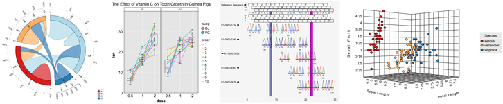
CanvasXpress was developed as the core visualization component for bioinformatics and systems biology analysis at Bristol-Myers Squibb. It supports a large number of visualizations to display scientific and non-scientific data. CanvasXpress also includes a simple and unobtrusive user interface to explore complex data sets, a sophisticated and unique mechanism to keep track of all user customization for Reproducible Research purposes, as well as an 'out of the box' broadcasting capability to synchronize selected data points across all CanvasXpress plots in a page. Data can be easily sorted, grouped, transposed, transformed or clustered dynamically. The fully customizable mouse events as well as the zooming, panning and drag-and-drop capabilities are features that make this library unique in its class.
CanvasXpress can be now be used within Python for native integration into IPython and Web environments, such as:
Complete examples using the CanvasXpress library including the mouse events, zooming, and broadcasting capabilities are included in this package. This CanvasXpress Python package was created by Dr. Todd C. Brett, with support from Aggregate Genius Inc., in cooperation with the CanvasXpress team.
The maintainer of the Python edition of this package is Dr. Todd C. Brett.
Project Status
| Topic | Status |
|---|---|
| Version and Platform |    |
| Popularity |  |
| Status |    |
Enhancements
A complete list of enhancements by release date is available at the CanvasXpress for Python Status Page.
Roadmap
This package is actively maintained and developed. Our focus for 2021 is:
Immediate Focus
- Plotly Dash integration
- Detailed documentation and working examples of all Python functionality
General Focus
- Embedded CanvasXpress for JS libraries (etc.) for offline work
- Integraton with dashboard frameworks for easier applet creation
- Continued alignment with the CanvasXpress Javascript library
- Continued stability and security, if/as needed
Getting Started
Documentation
The documentation site contains complete examples and API documentation. There is also a wealth of additional information, including full Javascript API documentation, at https://www.canvasxpress.org.
New: Jupyter Notebook based examples for hundreds of chart configurations!
A Quick Script/Console Example
Charts can be defined in scripts or a console session and then displayed using the default browser, assuming that a graphical browser with Javascript support is available on the host system.
from canvasxpress.canvas import CanvasXpress
from canvasxpress.render.popup import CXBrowserPopup

if __name__ == "__main__":
    # Define a CX bar chart with some basic data
    chart: CanvasXpress = CanvasXpress(
        data={
            "y": {
                "vars": ["Gene1"],
                "smps": ["Smp1", "Smp2", "Smp3"],
                "data": [[10, 35, 88]]
            }
        },
        config={
            "graphType" : "Bar"
        }
    )

    # Display the chart in its own Web page
    browser = CXBrowserPopup(chart)
    browser.render()
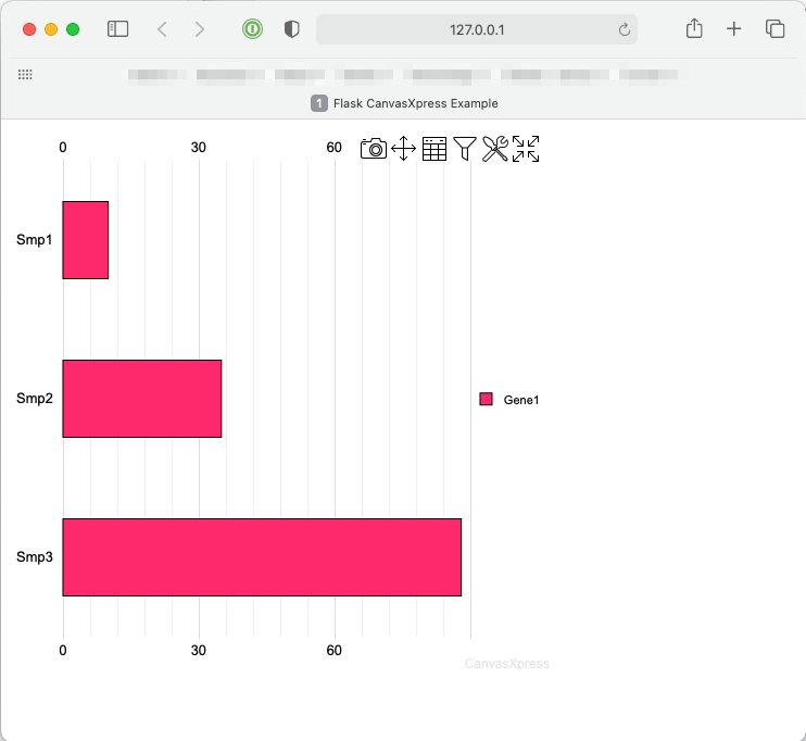
Upon running the example the following chart will be displayed on systems such as MacOS X, Windows, and Linux with graphical systems:
A Quick Flask Example
Flask is a popular lean Web development framework for Python based applications. Flask applications can serve Web pages, RESTful APIs, and similar backend service concepts. This example shows how to create a basic Flask application that provides a basic Web page with a CanvasXpress chart composed using Python in the backend.
The concepts in this example equally apply to other frameworks that can serve Web pages, such as Django and Tornado.
Create a Basic Flask App
A basic Flask app provides a means by which:
- A local development server can be started
- A function can respond to a URL
First install Flask and CanvasXpress for Python:
pip install -U Flask canvasxpress
Then create a demo file, such as app.py, and insert:
# save this as app.py
from flask import Flask

app = Flask(__name__)

@app.route('/')
def canvasxpress_example():
    return "Hello!"
On the command line, execute:
flask run
And output similar to the following will be provided:
Running on http://127.0.0.1:5000/ (Press CTRL+C to quit)
Browsing to http://127.0.0.1:5000/ will result in a page with the text Hello!.
Add a Chart
CanvasXpress for Python can be used to define a chart with various attributes and then generate the necessary HTML and Javascript for proper display in the browser.
Add a templates directory to the same location as the app.py file, and inside add a file called canvasxpress_example.html. Inside the file add:
<html>
    <head>
        <meta charset="UTF-8">
        <title>Flask CanvasXpress Example</title>

        <!-- 2. Include the CanvasXpress library -->
        <link
                href='https://www.canvasxpress.org/dist/canvasXpress.css'
                rel='stylesheet'
                type='text/css'
        />
        <script
                src='https://www.canvasxpress.org/dist/canvasXpress.min.js'
                type='text/javascript'>
        </script>

        <!-- 3. Include script to initialize object -->
        <script type="text/javascript">
            onReady(function () {
                {{canvas_source|safe}}
            })
        </script>

    </head>
    <body>

        <!-- 1. DOM element where the visualization will be displayed -->
        {{canvas_element|safe}}

    </body>
</html>
The HTML file, which uses Jinja syntax achieves three things:
- Provides a location for a
<div>element that marks where the chart will be placed. - References the CanvasXpress CSS and JS files needed to illustrate and operate the charts.
- Provides a location for the Javascript that will replace the chart
<div>with a working element on page load.
Going back to our Flask app, we can add a basic chart definition with some data to our example function:
from flask import Flask, render_template
from canvasxpress.canvas import CanvasXpress

app = Flask(__name__)

@app.route('/')
def canvasxpress_example():
    # Define a CX bar chart with some basic data
    chart: CanvasXpress = CanvasXpress(
        data={
            "y": {
                "vars": ["Gene1"],
                "smps": ["Smp1", "Smp2", "Smp3"],
                "data": [[10, 35, 88]]
            }
        },
        config={
            "graphType" : "Bar"
        }
    )

    # Get the HTML parts for use in our Web page:
    html_parts: dict = chart.render_to_html_parts()

    # Return a Web page based on canvasxpress_example.html and our HTML parts
    return render_template(
        "canvasxpress_example.html",
        canvas_element=html_parts["cx_canvas"],
        canvas_source=html_parts["cx_js"]
    )
Rerun the flask app on the command line and browse to the indicated IP and URL. A page similar to the following will be displayed:
Congratulations! You have created your first Python-driven CanvasXpress app!

 3.1k Jan 01, 2023
 1.4k Dec 15, 2022
 2 Nov 04, 2021
 1 Feb 06, 2022
 5 Nov 22, 2022
 0 May 04, 2022
 27 Dec 03, 2022
 21 Dec 14, 2022
 445 Jan 04, 2023
 5 Sep 02, 2022
 83 Nov 26, 2022
 3.1k Jan 08, 2023
 1.7k Jan 09, 2023
 22 Oct 31, 2022
 50k Jan 06, 2023
 214 Jan 07, 2023
 105 Dec 15, 2022
 2 Dec 09, 2021
 1 Sep 01, 2022
 504 Dec 15, 2022