Plot and save the ground truth and predicted results of human 3.6 M and CMU mocap dataset.

Overview

Visualization-of-Human3.6M-Dataset

Plot and save the ground truth and predicted results of human 3.6 M and CMU mocap dataset.

human-motion-prediction

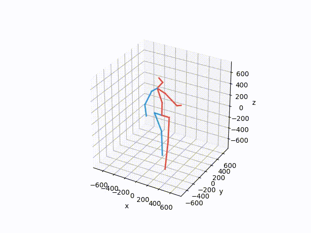
This is the code for visulalizing the ground truth and predicted results of human 3.6M dataset.

To save the gif for ground truth data, ru

python forward_kinematics.py --save --save_name "figs/walking.gif"

To save visualization for trained modeld sample.h5, run

 python forward_kinematics.py --sample_name samples.h5 --save --save_name "figs/walking_py_0.gif"

Finally, to visualize the samples run

python forward_kinematics.py

This should create a visualization similar to this one


In data folder it has only subject 5 due to space constraint.

To download full dataset follow this

wget http://www.cs.stanford.edu/people/ashesh/h3.6m.zip

Acknowledgments

Julieta Martinez, Michael J. Black, Javier Romero. On human motion prediction using recurrent neural networks. In CVPR 17.

It can be found on arxiv as well: https://arxiv.org/pdf/1705.02445.pdf

The code in this repository was written by Julieta Martinez and Javier Romero.

Thank you

Gaurav

Owner
Gaurav Kumar Yadav
Reason should be strong to achieve some things.
Gaurav Kumar Yadav
Keir&'s Visualizing Data on Life Expectancy

Keir's Visualizing Data on Life Expectancy Below is information on life expectancy in the United States from 1900-2017. You will also find information

9 Jun 06, 2022
JupyterHub extension for ContainDS Dashboards

ContainDS Dashboards for JupyterHub A Dashboard publishing solution for Data Science teams to share results with decision makers. Run a private on-pre

Ideonate 179 Nov 29, 2022
Movies-chart - A CLI app gets the top 250 movies of all time from imdb.com and the top 100 movies from rottentomatoes.com

movies-chart This CLI app gets the top 250 movies of all time from imdb.com and

3 Feb 17, 2022
SummVis is an interactive visualization tool for text summarization.

SummVis is an interactive visualization tool for analyzing abstractive summarization model outputs and datasets.

Robustness Gym 246 Dec 08, 2022
πŸ—Ύ Streamlit Component for rendering kepler.gl maps

streamlit-keplergl πŸ—Ύ Streamlit Component for rendering kepler.gl maps in a streamlit app. 🎈 Live Demo 🎈 Installation pip install streamlit-keplergl

Christoph Rieke 39 Dec 14, 2022
Mapomatic - Automatic mapping of compiled circuits to low-noise sub-graphs

mapomatic Automatic mapping of compiled circuits to low-noise sub-graphs Overvie

Qiskit Partners 27 Nov 06, 2022
plotly scatterplots which show molecule images on hover!

molplotly Plotly scatterplots which show molecule images on hovering over the datapoints! Required packages: pandas rdkit jupyter_dash ➑️ See example.

150 Dec 28, 2022
A shimmer pre-load component for Plotly Dash

dash-loading-shimmer A shimmer pre-load component for Plotly Dash Installation Get it with pip: pip install dash-loading-extras Or maybe you prefer Pi

Lucas Durand 4 Oct 12, 2022
a simple REPL display lib for circuitpython

Circuitpython-termio-lib a simple REPL display lib for circuitpython Fonctions cls clear terminal screen and set cursor on top left : coords 0,0 usage

BeBoXoS 1 Nov 17, 2021
WebApp served by OAK PoE device to visualize various streams, metadata and AI results

DepthAI PoE WebApp | Bootstrap 4 & Vue.js SPA Dashboard Based on dashmin (https:

Luxonis 6 Apr 09, 2022
GUI for visualization and interactive editing of SMPL-family body models ie. SMPL, SMPL-X, MANO, FLAME.

Body Model Visualizer Introduction This is a simple Open3D-based GUI for SMPL-family body models. This GUI lets you play with the shape, expression, a

Muhammed Kocabas 207 Jan 01, 2023
FairLens is an open source Python library for automatically discovering bias and measuring fairness in data

FairLens FairLens is an open source Python library for automatically discovering bias and measuring fairness in data. The package can be used to quick

Synthesized 69 Dec 15, 2022
Pebble is a stat's visualization tool, this will provide a skeleton to develop a monitoring tool.

Pebble is a stat's visualization tool, this will provide a skeleton to develop a monitoring tool.

Aravind Kumar G 2 Nov 17, 2021
βœ… Today I Learn

Today I Learn EDA numpy_100ex numpy_0~10 airline_satisfaction_prediction BERT_naver_movie_classification NLP_prepare NLP_Tweet_Emotion_Recognition tex

Yeonghoo_Ahn 3 Dec 15, 2022
A python script and steps to display locations of peers connected to qbittorrent

A python script (along with instructions) to display the locations of all the peers your qBittorrent client is connected to in a Grafana worldmap dash

62 Dec 07, 2022
Some problems of SSLC ( High School ) before outputs and after outputs

Some problems of SSLC ( High School ) before outputs and after outputs 1] A Python program and its output (output1) while running the program is given

Fayas Noushad 3 Dec 01, 2021
A custom qq-plot for two sample data comparision

QQ-Plot 2 Sample Just a gist to include the custom code to draw a qq-plot in python when dealing with a "two sample problem". This means when u try to

1 Dec 20, 2021
Generate graphs with NetworkX, natively visualize with D3.js and pywebview

webview_d3 This is some PoC code to render graphs created with NetworkX natively using D3.js and pywebview. The main benifit of this approac

byt3bl33d3r 68 Aug 18, 2022
GitHubPoster - Make everything a GitHub svg poster

GitHubPoster Make everything a GitHub svg poster ζ”―ζŒ Strava εΌ€εΏƒθ―εœΊ 扇贝 Nintendo Switch GPX ε€šι‚»ε›½ Issue

yihong 1.3k Jan 02, 2023
Active Transport Analytics Model (ATAM) is a new strategic transport modelling and data visualization framework for Active Transport as well as emerging micro-mobility modes

{ATAM} Active Transport Analytics Model Active Transport Analytics Model (β€œATAM”) is a new strategic transport modelling and data visualization framew

Peter Stephan 0 Jan 12, 2022